March 2023
airluggage
About
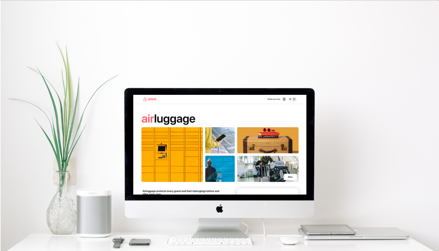
My team and I understood that many users of airbnb, including ourselves, were often running into the issue of arriving to your airbnb before it was ready, and then feeling like you can’t do anything until it is ready because you have to worry about taking all of your luggage with you.
Our goal was to create a new airbnb feature that takes the stress off customer’s shoulders, and allows them to explore their destination, have fun, or do whatever they like to make the most of their travels without having to worry about their luggage.
The main problem we found was that airbnb customers who arrive at their accommodations before the scheduled check-in time need peace of mind that their belongings are secure in order for them to be able to make the most of their time traveling.
As a traveler and airbnb user myself, I can totally relate to the need for this feature. I have found myself in multiple situations where I am on a vacation and we arrive early in the morning to our location but just have to wait around until our airbnb is ready. If there was a secure storage locker for luggage nearby, I know that I would definitely use it to store my belongings so I can make the most of my day and vacation.
Our user research really reflected my same struggles, which stressed that other users are experiencing these problems often, and a solution to this would be received well.
I used tools such as Miro, Figma, Descript, Google Suite, Zoom, and InVIsion.
Goal
To create an accessible and simple luggage storing feature for users so that they can easily, affordably, and securely store their luggage so that they can make the most of their travels worry-free.

Our miro board used to document our work
Process & Timeframe
The purpose of this project was for me to work with my team and handle all the steps in a full product development process. This started with a problem definition, and went all the way to coding the final design.
This project took place over a span of two weeks and was completed remotely. We used Zoom, Slack, and Miro to communicate with each other and work together throughout the process.
Conducted:
Research (user interviews, market analysis, surveys)
Information Architecture
Wire Framing
Designing
Prototyping
Usability Testing (1 on 1 user tests)
Front End Development
Product Presentation for Peers and Instructors
Research
Target group & research findings
We identified the ideal target group as current airbnb users who have just completed a booking through airbnb. One scope consideration was the short amount of time that we had to complete this project, so we decided that we would start the new feature process once a user books through airbnb and receives their itinerary.
I interviewed airbnb users, friends and family in order to find the main pain points from users when they are traveling with luggage. We also used surveys in order to reach a wider audience and learn more about people who travel in general. One main takeaway from our survey findings was that 60% of people who travel do so with luggage. This shows the broad audience that would have a need for this feature
The main user insight that came from our research was that users do really have a need for this feature. Users are looking for a safe, secure, and stress-free luggage storing option that they can trust in.
We used the insights from user interviews to create an affinity diagram. This helped us pick apart the main problems that users are facing, and also helped us get a clearer view of we can do to solve those problems.
“I would definitely like to be able to control the storage time just in case of unforseen events”


Market Research
In my competitor analysis, I examined two other companies, Bounce and Luggage Hero, who would be airluggage’s main competitor in the luggage storing industry. One main difference between airluggage and its competitors was that Bounce and Luggage Hero use large spaces, such as storage rooms to store their customer’s luggage. In comparison, airluggage would use private, self-serve lockers (similar to Amazon pickup lockers) for customer’s to be able to securely and privately store their luggage. This eliminates security worries that customer’s may have regarding storing their valuables and luggage.
Our market research also brought to light the business aspects of deciding to charge users a flat rate per day, per hour, or charge based on storage size. Our competitors used two different methods, one used a flat rate of $5.90 per day, and the other used a hourly rate of $0.95 an hour. We decided that for airbnb users who don’t need these lockers all day, it would be best to use the hourly rate, which varied based on storage luggage size (small, medium, large, etc.). In addition, all of our interviewee’s responded that they would be ok with paying a small fee if it meant that they could securely store their luggage.
Information Architecture
After user research and market research, as well as some iterations from mentors, our group started thinking about potential features for the new product using information architecture.
Features
Simple user flow - Due to time constraints (only two weeks to complete this project) we had to pick and choose our battles, so we decided to start our user flow at the end of the airbnb booking process. The end of the airbnb booking process is when the user completes their airbnb reservation and has received their email confirmation and itinerary for their booking. In said email confirmation and itinerary is where we would have our “call to action” button, encouraging users to reserve a storage locker if they are will be arriving early to their airbnb before it’s ready. We understand that users may be mentally tired after booking an airbnb, so we had a goal to keep this additional process of booking a storage locker as simple as possible. We decided to keep the process in three easy steps;
1. Click “Reserve locker”
2. Decide where (location) and when (time range) you need your storage locker
3. Confirm and pay
Security - In our user interviews and survey responses, nearly all of our respondents mentioned that security is a make-or-break for them. We took this very seriously, and implemented a few different features to help cater to those needs.
Firstly, we added a section in our updated itinerary page (now equipped with both airbnb reservation details and airluggage reservation details) where the user will be able to see their secure key code for their self-serve locker that will only work at the time of their reservation.
Additionally, we decided to add a second layer of security to this, where the user can decide to create their own secure key code, instead of receiving a generated code. Our user research helped us understand that users feel the most secure and at-ease when they are aware of the security process and have a stake in it, if possible. Because of this, we decided to implement the added feature of creating your own key code.
We also added a section to our airluggage homepage that explain how these self-serve storage lockers will have around the clock security and staff that will be available for assistance.
User Flow
he user flow was really fun to work with, just because we had a pretty clear idea of what we wanted the experience to be like. One thing that we did have to keep in mind was understanding that user’s may want to pass up on this feature, so we had to build that into our flow.
While creating our user flow, we identified three main goals for our user:
Our first goal was that we wanted the user to identify whether or not they had a need for the airluggage storage lockers.
Secondly, we wanted the user to understand what airluggage is and how it works, as well as when/how to use it.
Finally, we wanted our user to be able to complete the reservation and checkout process.

The “reserve locker” call to action button
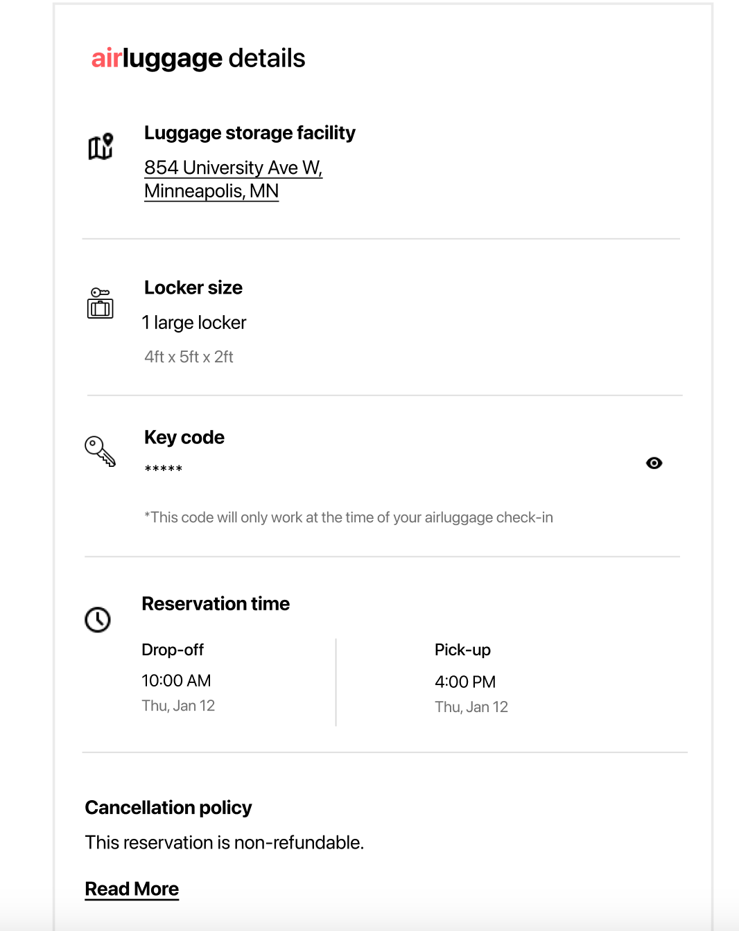
The updated itinerary page with airluggage details. The secure key code is also shown as hidden, with an option for the user to view it, while also understanding that this code won’t work until their airluggage check-in time.

Wireframes
Our wireframes were pretty straight forward, and followed our user flow. Keeping our user in mind, we worked to make sure that the process was as simple and easy to understand as possible. We ended up creating four pages and kept the same design, layout, and animations as the current airbnb website.
My team and I worked together to create sketches as a group first, and then built them up into lo/mid-fi versions on Figma.
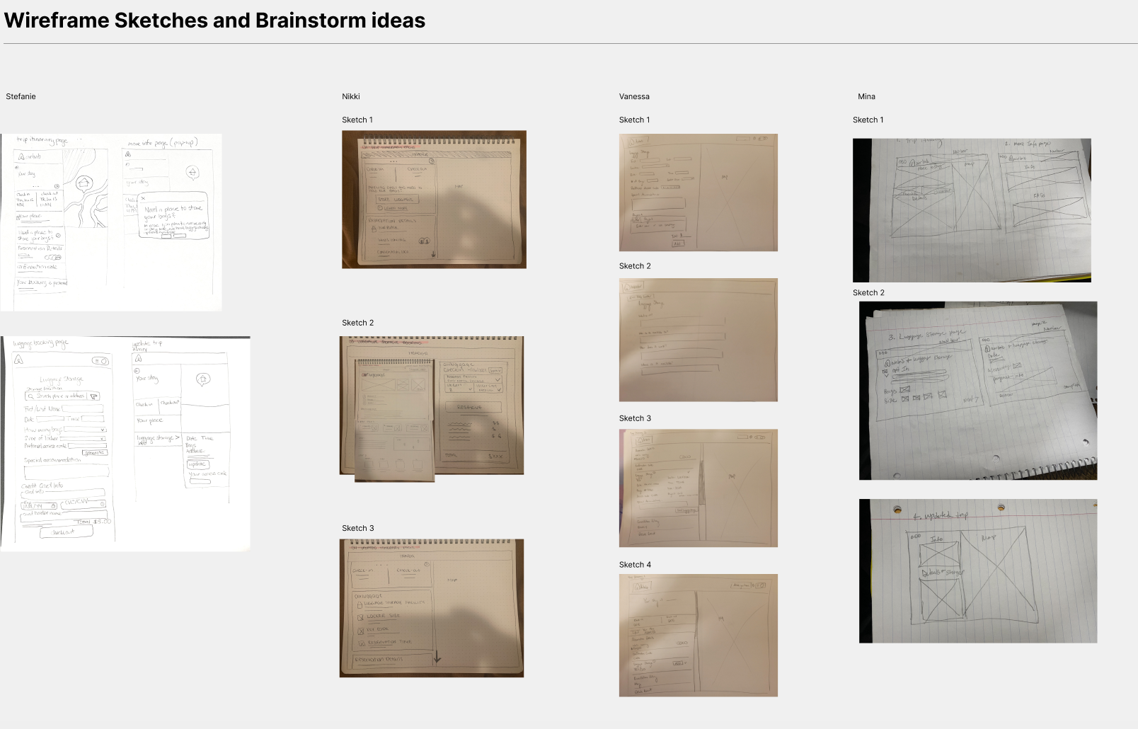

Sketches to wireframes
Design & Prototypes
As mentioned previously, we worked to keep our designs as close as possible to the current airbnb website. This was really fun for me, and I especially enjoyed creating and designing the new features to be as similar as possible to the current website. In order to do this on Figma, we created a UI design style tile, and also searched the Figma community for help and inspiration with the airbnb animations, fonts and other design elements.
Iterations
We went through a few rounds of iterations, relying on user testing interviews, as well as feedback from our instructors. Some main iterations were:
Changing the wording from “check-in” and “checkout” to “pick-up” and “drop-off.” We originally had check-in and checkout when referring to our airluggage reservation times, but after user testing, we found that the wording was too similar to the airbnb reservations (which use “check-in” and “checkout.
We also added the location of the users selected luggage storage facility in the updated itinerary page. This was because after user testing, we received feedback that users were confused and wanted to make sure that they had chosen the right location.
Additionally, we added recommended locations to our reserve page when users would be choosing their location, just to make it easier for the user.
Hi-Fi Prototype & Final Product
The coding was definitely the most challenging part of this project for me, but I really enjoyed learning more about the front-end development process and seeing our designs really come to life.
Below is a screen recording of our final clickable prototype, created on Figma. Our team also coded this during our front-end development, using GitHub and VSCode. We used coding elements such as HTML, CSS, Javascript, and Bootstrap.
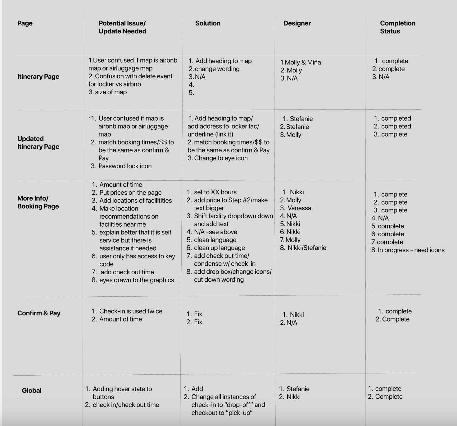
The chart we used to delegate making iterations and fixing other issues
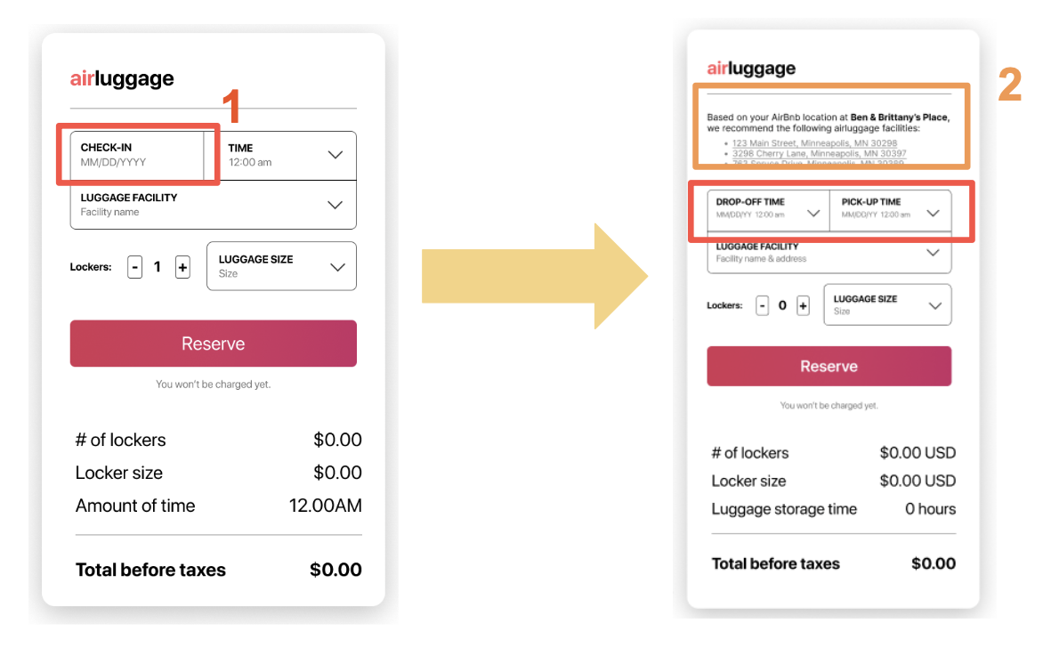
“Check-in” to “drop-off” iteration
“It’s [airluggage] a very practical way of not having to worry about feeling dragged down with luggage”
Summary
This project was really fun to work on, and I loved being able to create something that could be really useful for a lot of people! This project also took place over the span of just two and a half weeks, so it was definitely an experience. Overall, I really enjoyed working on this project, and I would love to see it become developed someday in the future!
Also a special shoutout to my amazing team members who were so fun to work with; Miña Grayer, Nikki Burden, Vanessa Osterberg, and Stefanie Dinh-Nguyen.
