H-E-B Meal Planning Feature
October 2022 - November 2022
Finding out how to integrate meal planning into young adults lives with a grocery store app

About
My team and I created a new meal plan feature on the H-E-B mobile app, which allows users to find recipes with ingredients sold at H-E-B grocery stores. Users can add the recipes to their meal plan through the app, then purchase the ingredients through pick up or delivery.
The main problem we found was that young adults who want to eat healthier and save money are lacking resources that would give them more options for a balanced, home cooked and varied diet.
As a young adult myself, I can totally relate to the need for this feature. I have always found myself wanting to try meal planning, but whenever I have attempted to actually meal plan, I find myself giving up because I don’t have the needed ingredients at home, or I don’t know the recipe/how to actually cook something nutritious.
Our research really reflected my same struggles, which definitely helped my sympathize with our users.
I used tools such as Miro, Figma, Descript, Google Suite, Zoom, and InVIsion
Goal
Create a new meal planning feature that not only allows users to effectively meal plan, but also encourages them to stick with it and continue meal planning and trying new recipes & foods
Process & Timeframe
The purpose of this project was for me to work with my team and handle all the steps in a full product development process. This started with a problem definition, and went all the way to the final design.
This project took place over a span of four weeks and was completed remotely. We used Zoom, Slack, and Miro to communicate with each other and work together throughout the process.
Conducted:
Research (user interviews, market analysis, surveys)
Information Architecture
Wire Framing
Designing
Prototyping
Usability Testing (1 on 1 user tests)
Product Presentation for Peers and Instructors
Research
Target group - user research results
We identified the ideal target group as young adults ages 20-30. We found this age group from research conducted by meal kit retailers, such as Hello Fresh and Blue Apron.
I interviewed friends and families in order to find the main pain points from users when grocery shopping, using meal planning apps/trying to meal plan, and using grocery store apps.
The main user insight that came from our research was that young adults who are looking to eat healthier and eat out less need to feel more equipped with recipes and ingredients that will help them cook at home easier and eat healthier.
User research really opened my eyes to the many struggles that users experience with grocery shopping and meal planning. It was also nice to know that other people experience the same struggles that I do when trying to meal plan!
We used the insights from user interviews to create an affinity diagram. This helped us pick apart the main problems that users are facing, and also helped us get a clearer view of we can do to solve those problems

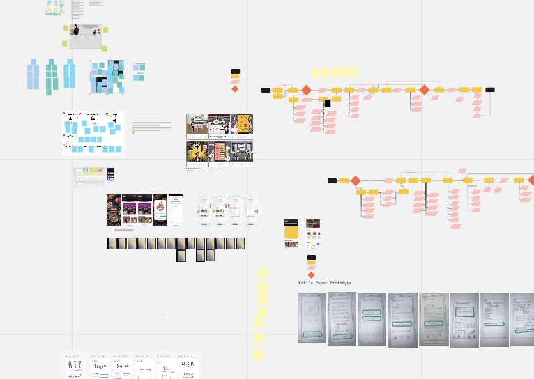
Our team’s miro board with our work from the project

“It would be cool if there was something that suggested recipes to me”


Market Research
In my competitor analysis, I found that other companies seem to be oriented in a similar way, hoping to provide users with meal planning options. However, these other competitors, such as Target, Cub, and Trader Joes don’t seem to have everything all in one place. For example, they would have recipes and ingredients, but not the meal planning aspect, or vice versa. Overall, the main finding from my market research that I conducted was that there needs to be an app that has everything all in one place.
I also thought it would be insightful to take a look at meal planning apps, such as Paprika and Yummly. These online meal planning resources were great at keeping users on track and helping them easily plan out their meals for the week. However, some users were disappointed in Yummly’s lack of a “pantry” to remember meals, and also lacked a recipe-editing function.
From this, we learned that is essential to account for users who have dietary restrictions, such as allergies/sensitivities, but are still looking to enjoy recipes and meal plan through the H-E-B app. We made this a top priority while entering into our information architecture phase.
Information Architecture
After user research and market research, as well as some iterations from mentors, our group started thinking about potential features for the new product using information architecture.
Features:
Dietary Restrictions - allows users to check off ingredients they are sensitive to and receive recipes that cater to those restrictions. Users can also see substitutions for ingredients in recipes containing their restriction.
Recommended Recipes - the app recommends recipes to users based on their previous ingredient purchases. Not only helps users try new recipes, but also helps users finish off their food that they already have at home, reducing waste and keeping users happy!
User-uploaded Recipes - an option for users to upload their own recipes to the app. This allows users to share their most-loved recipes, whether they be family traditions or personal faves.
Coupons & Deals - who doesn’t like to save money? A feature that shows when an ingredient is on sale, helping users to save money while meal planning. Keeping in mind that the target audience is aged 20-30, and might be looking to save some money here and there.
User Flow
The user flow was something that was difficult for me at first, but after a few iterations it got easier. One challenge that we ran into was that there were just too many steps in our process for creating a new meal plan. To combat this, we brought in outside people and had them help us understand what the simplest path was for users who were unaware of the existing app. This helped my sympathize with the user and further understand what is going through their heads, not just my own.
We tried to keep our user flow similar to the flow of the existing app. For example, the sign up process and checkout process stayed the same.

Wireframes
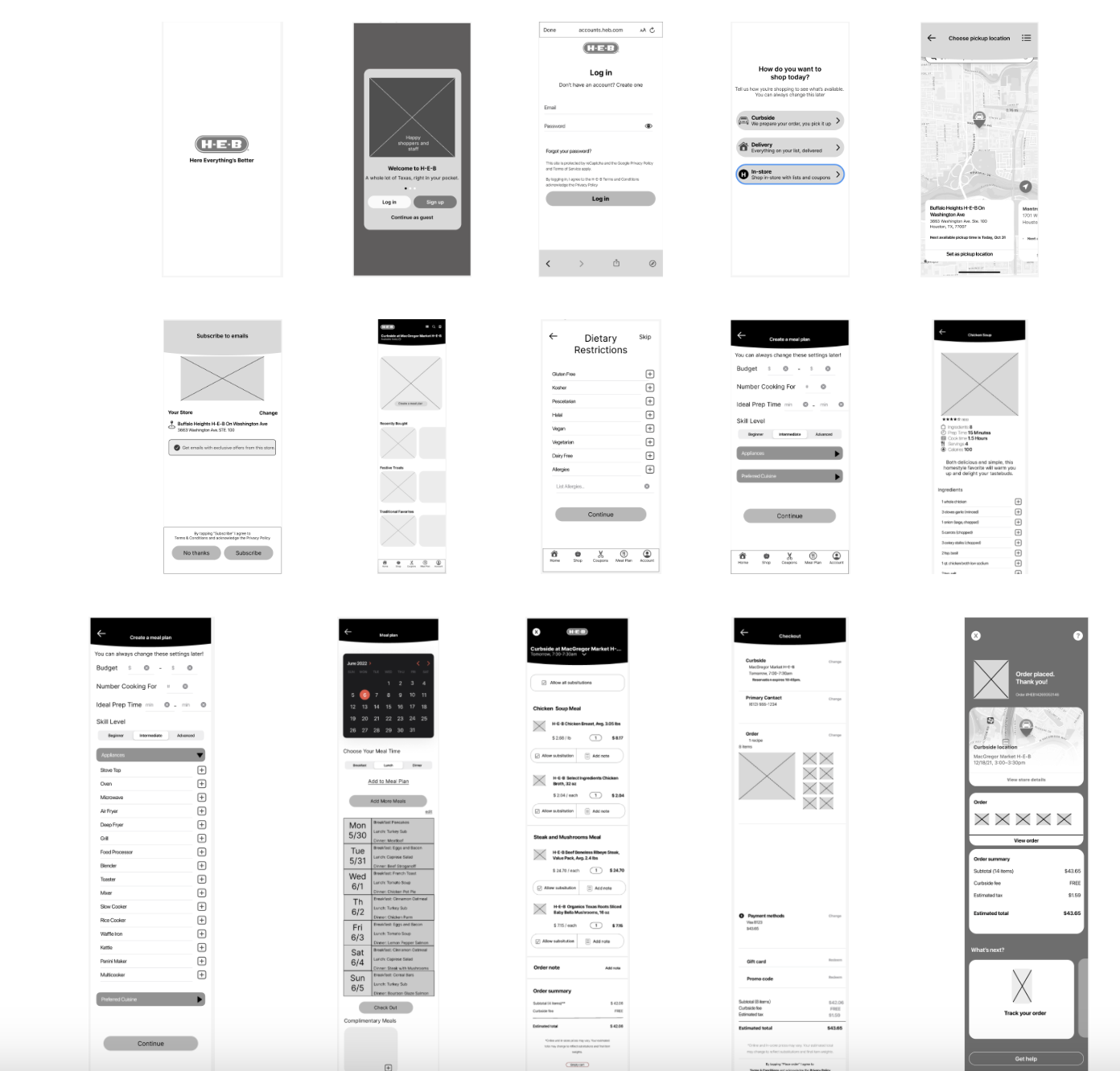
Wireframes helped me to think about the layout of the product as well as the user journey as they go through the design. Wireframing also helped our team decide on a final design, as we all created our own and then used a frankenstein-method to bring together our favorite aspects of each designers ideas.
I started my wireframing with sketches, which allowed me to quickly bring my ideas to life and iterate upon them.

Wireframes/feature ideation sketches
Design
As we were starting to put our ideas to life, we thought it was really important to keep all of the design elements the same as the already existing H-E-B mobile app. This would allow seamless transition when adding the new feature to the existing mobile app.
Due to the time length of this project, we didn’t have time to turn it to full-color scale. In the future when this does go to the high fidelity level, I will bring in all the same colors used in the current H-E-B mobile app.

Prototype
I used Figma to create and further design the new meal plan feature.
We brought in different interactions and made everything clickable. Our goal was to continue to keep the process and functions the same, or as similar as possible to the existing H-E-B mobile app.
Final design
The final design was the simplest version out of all of the previous iterations, and was focused on keeping everything easy for the user, while also continuing to be visually appealing.
The final product actually does not exist because this was just a project and was presented to other peers and instructors. If it were to exist, I would love to take more time to add more color to the prototype, and also iterate on the calendar section of the new meal planning feature.
Summary
I loved this project, and I honestly had a great time throughout the entire process. I tried many new things, and also learned many new things! This project really did change my way of thinking, and the whole thing really was not as easy as it looked like. I really enjoyed using Figma to create the prototypes and help my ideas come to life. The most important thing I learned was how meaningful it is to be able to keep design elements the same when create a new addition to an already existing app or website.
A special thanks to my team members, Nathan Silver and Kati Stamato, who each were awesome to work and learn with.